Flash Video Player Skin Doesn’t Appear

I just tried to place a Flash SWF file containing a short video of snow falling onto the entry page, and discovered the Video Player controls weren’t wasn’t appearing.

Apparently, the Video Player skin SWF file must be in the same directory as the HTML file accessing it. (The video itself can be in any other directory, as long as its path is referenced in the Object tag.)

Posted in Flash, Flash - Video | Comments Off on Flash Video Player Skin Doesn’t Appear

Footnote Symbols

For a small number of footnotes, these symbols are traditionally used in the following order:

  1. * (asterisk)
  2. † (dagger)
  3. ‡ (double-dagger)
  4. § (section sign)
  5. ∥ (parallel sign)
  6. ¶ (paragraph symbol)

These are obtained with the following HTML entity names or numbers:

          *
&‍dagger; ➨ †
&‍Dagger; ➨ ‡
&‍sect;   ➨ §
&‍#8741;  ➨ ∥
&‍para;   ➨ ¶

Some acceptable alternatives for the asterisk (*) could be:

  1. ✥ (four club-spoked asterisk)
  2. ✦ (black four-pointed star)
  3. ✧ (white four-pointed star)
  4. ✫ (open center black star)
  5. ✭ (outlined black star)
  6. ✯ (pinwheel star)
  7. ✲ (open center asterisk)
  8. ✵ (eight-pointed pinwheel star)
  9. ✸ (heavy eight-pointed rectilinear black star)
  10. ✻ (teardrop-spoked asterisk)
  11. ✼ (open center teardrop-spoked asterisk)
  12. ❆ (heavy chevron snowflake)
  13. ❋ (heavy 8 teardrop-spoked propeller asterisk)

These are obtained with the following HTML entity names or numbers:

✥ ➨ ✥
✦ ➨ ✦
&‍#10023; ➨ ✧
&‍#10027; ➨ ✫
&‍#10029; ➨ ✭
&‍#10031; ➨ ✯
&‍#10034; ➨ ✲
&‍#10037; ➨ ✵
&‍#10040; ➨ ✸
&‍#10043; ➨ ✻
&‍#10044; ➨ ✼
&‍#10054; ➨ ❆
&‍#10059; ➨ ❋

Of these, I personally prefer the open center asterisk (✲) to the ordinary asterisk (*). This results in the following final set of HTML entity names and numbers:

&‍#10034; ➨ ✲
&‍dagger; ➨ †
&‍Dagger; ➨ ‡
&‍sect;   ➨ §
&‍#8741;  ➨ ∥
&‍para;   ➨ ¶
Posted in HTML & CSS | Comments Off on Footnote Symbols

How To Create Distressed Type

For a while, this blog used an image for the blog title using an un-distressed font. Unfortunately, this image seemed shockingly black — and just a little too crisp and clean.

Blog title in Grecian Empire font using Photoshop Text tool

After experimenting with a number of different methods for distressing fonts, the following procedure was ultimately settled upon:

  1. Open Photoshop, and create a new page 610 px wide X 72 px high.
  2. Select the Text tool and type out, “Chou Seh-fu Blog,” in the Grecian Empire font at 70 px. This creates the original (un-distressed type).
  3. Right-click on the text layer and choose Duplicate.
  4. Turn off the visibility of the original text layer. (Keep it in case you make an error & need to start over!)
  5. Right-click on the duplicate layer and choose Rasterize Type.
    Grecian Empire font with ordinary type (Photoshop screenshot)
  6. Select Filter > Blur > Gaussian and set filter to a 1 px radius. Click OK.Gaussian blur of type (Photoshop screenshot)Gaussian blur of blog title
  7. Select Filter > Sharpen > Smart Sharpen, and set the filter as follows:
    Amount: 500%
    Radius: 0.5px
    Remove: Gaussian BlurSmart Sharpened type (Photoshop screenshot)Smart Sharpened blog title
  8. Duplicate this layer and turn off the visibility of the top layer.
  9. Select the lower (original rasterized) layer.
    Duplicated layer (Photoshop screenshot)
  10. Click on the layer thumbnail and choose Bevel > Emboss > Texture. Choose Clouds, and use the following settings:
    Scale: 95%
    Depth: 100%
  11. Click OK.
    Cloud texture applied to type (Photoshop screenshot)Cloud texture on blog title
  12. Choose Filter > Noise > Add Noise. Use the following settings:
    Amount: 15%
    Distribution: Gaussian
    Monochromatic:
    Gaussian Noise added to type (Photoshop screenshot)Gaussian Noise on blog title
  13. Choose Filter > Filter Gallery > Artistic > Plastic Wrap. Use the following settings:
    Highlight Strength: 10
    Detail: 12
    Smoothness: 11.
  14. Click OK.
    Plastic Wrap applied to type (Photoshop screenshot)Plastic wrap on blog title
  15. That’s actually a little too much. To dial it back a bit, click on the top layer and make it visible again. Set its Opacity to 8%.
  16. Click OK.
    Type darkened slightly (Photoshop screenshot)Distressed type blog title slightly darkened

Postscript: It is a simple matter to further transform this black-and-white image into color.

  1. Select Image > Mode > Grayscale.
  2. Choose Merge and then Discard.
  3. After this, select Image > Mode > Duotone.
  4. Choose Custom and Monotone, clicking on the color picker for the color of your choice.
  5. Now click OK.
    Blue distressed type blog title
  6. Select Image > Mode > RGB. (The file will not be able to save as a PNG otherwise).
  7. Save file with a different name so that the previous (black ink) version is not overwritten!
Posted in Photoshop tutorials | Comments Off on How To Create Distressed Type

Turn A Background Image Into A Link Part 2: Creating Different Link States

In the previous post, I showed how a background image was converted into a clickable link. But the link looked like this at all times, for all click states:

Blog title background image (black distressed font displays for all link states)

In this post, I’ll demonstrate how to load in different background images for different click states (such as mouse-overs and clicks).

First off, the background image was removed from the h1#site-title selector:

#site-title {
	float: left;	
	line-height: 36px;

       /* BACKGROUND IMAGE CSS CODE REMOVED FROM HERE... */

	height: 100px;
       width: 650px;
	white-space: nowrap;
	overflow: hidden;
}

The h1#site-title a selector’s CSS code was left alone:

#site-title a{
	display: block;
       /* MATCH THE SIZE OF THE MOUSE-OVER ZONE TO THAT OF THE BACKGROUND IMAGE */
	height: 72px;
	width: 593px;
	text-indent: 9999px;
}

But now, rules for different background images for the anchor tag’s pseudo-classes were given.

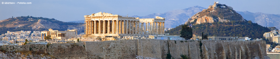
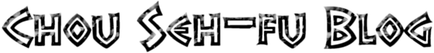
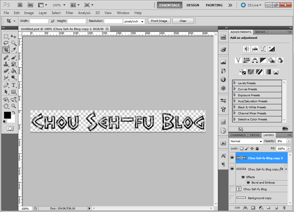
First, the default background image should be a black, distressed font version of the blog title:

#site-title a:link, #site-title a:visited{
	background-image: url('https://www.chou-seh-fu.com/wordpress/tiles/chouSehFuBlogTitle-Large2.png');
	background-repeat: no-repeat;
}

When the link is not hovered over (or if it has been previously clicked), the following clickable background image will display the blog title:

Blog title (black distressed font for link and visited anchor tag states)

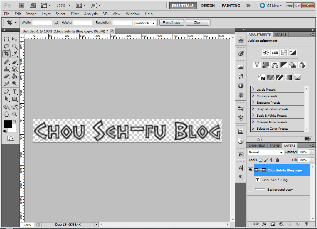
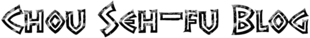
Next, use a different background image for the hover state:

#site-title a:hover{
	background-image: url('https://www.chou-seh-fu.com/wordpress/tiles/chouSehFuBlogTitle-Large2-Blue.png');
	background-repeat: no-repeat;
}

During mouseover events, the black, distressed font image will now be replaced by this blue, distressed font image:

Blog title (blue distressed font for hover anchor tag state)

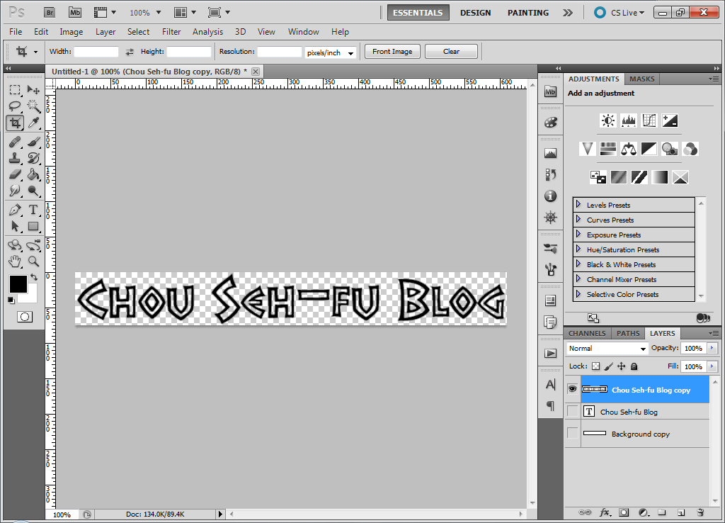
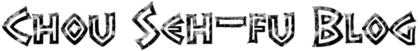
And finally, a different background image should be shown at the very instant the link is clicked:

#site-title a:active{
	background-image: url('https://www.chou-seh-fu.com/wordpress/tiles/chouSehFuBlogTitle-Large2-NotDistressed.png');
	background-repeat: no-repeat;
}

This styling code displays a solid black, un-distressed font version of the title when the link is clicked:

Blog title (black un-distressed font for active anchor tag state)

The Fly In The Ointment

The problem with the code as it stands is that the images for the hover state and the active state aren’t loaded into the cache when the page is loaded.

This means that the first time these two states are called upon the transition is not instantaneous: the background image from the previous state disappears, and no blog title is displayed while the current state’s background image loads.

I get around this by loading the hover and active states’ background images somewhere onto the page where they can’t be seen. Here, they are loaded behind the weathered rock background on the body tag:

body {
	background-image: url('https://www.chou-seh-fu.com/wordpress/tiles/stoneBkg.gif'), url('https://www.chou-seh-fu.com/wordpress/tiles/chouSehFuBlogTitle-Large2-Blue.png'), url('https://www.chou-seh-fu.com/wordpress/tiles/chouSehFuBlogTitle-Large2-NotDistressed.png');
	background-repeat: repeat, no-repeat, no-repeat;
}

The disadvantage of this approach is that it takes a fraction of a second longer for the page to load. But it’s a small price to pay for seamless background image transitions between the link, hover and active states.


The code in this post is word-wrapped. If copying & pasting, do NOT add returns to this code!

Posted in HTML & CSS, WordPress | Comments Off on Turn A Background Image Into A Link Part 2: Creating Different Link States

Turn A Background Image Into A Link

Background

Ordinarily, WordPress’ Twenty Ten theme places the blog name at the top left-hand corner of the blog, and makes it a link to the blog home page.

The default font was used on the ancient Greek blog for several months, until I decided it would look better in one of my favorite fonts — Grecian Empire.

In order to show what was done, it might help to see the HTML WordPress generates for this part of the blog:

<h1 id="site-title">
     <span>
          <a title="Chou Seh-fu Blog - Public" href="https://www.chou-seh-fu.com/wordpress/" rel="home">Chou Seh-fu Blog - Public</a>
     </span>
</h1>

A transparent PNG file containing the blog title in the Grecian Empire font was made with Photoshop and used as a background image for h1#site-title. This resulted in the following garbled display:

Blog title duplicated with anchor text and background image

To remove the anchor text, the visibility: hidden; CSS rule was applied:

Blog title displayed only with background image (anchor text hidden)

At some later point, the background image was further modified with Photoshop to distress the font:

Blog title displayed with background image (using distressed font)

The Problem

Visually, the header title was now where I wanted it to be, but at a cost: the anchor tag leading back to the blog home page was no longer operable (since it was no longer visible).

So how could the background image of the blog title be turned into a working link?

Solution

This issue was solved when I ran across a method for using CSS to turn background images into links by Aaron D. Campbell at Ran.ge. Instead of using CSS to hide the anchor tag, he uses text-indent to push the anchor text far to the right on the web page (while turning off word-wrapping and making sure that any overflowed text will be hidden.)

The final CSS code looked something like this:

#site-title {
	float: left;	
	line-height: 36px;

       /* SHOW THE BACKGROUND IMAGE. */
	background-image: url('https://www.chou-seh-fu.com/wordpress/tiles/chouSehFuBlogTitle-Large2.png');
	background-repeat: no-repeat;

       /* HEIGHT & WIDTH OF THE H1 TAG FOR FORMATTING PURPOSES. */
	height: 100px;
       width: 650px;

       /* DON'T ALLOW INDENTED TEXT TO BE WORD-WRAPPED. */
	white-space: nowrap;

       /* HIDE ANY TEXT THAT EXTENDS BEYOND THE WIDTH OF THE SITE TITLE H1 TAG */
	overflow: hidden;
}

#site-title a{
	display: block;
       /* MATCH THE SIZE OF THE MOUSE-OVER ZONE TO THAT OF THE BACKGROUND IMAGE */
	height: 72px;
	width: 593px;
        /* TEXT-INDENT OF +9999px WORKS FOR ALL BROWSERS EXCEPT OPERA... */
	text-indent: -9999px;
}

This all works pretty well – the site title image is now clickable. My next goal will be to switch out the background image depending on mouse actions.


The code in this post is word-wrapped. If copying & pasting, do NOT add returns to this code!

Posted in HTML & CSS, WordPress | Comments Off on Turn A Background Image Into A Link

WordPress Validation Error For Category Tags

Got around to validating this blog with the W3C Validator, and discovered there were 19 errors involving the category links.

Apparently, WordPress sets up these links with a rel="category tag" attribute, which doesn’t pass validation.

Ispire.me has the fix for this error, which is repeated here for my own future reference:

  1. Go to the /wordpress/wp-includes/ directory.
  2. Find the category-template.php file. Make a copy, and call it category-template-original.php.
  3. Edit the category-template.php file with Notepad++.
  4. Find line 163, which reads:
    $rel = ( is_object( $wp_rewrite ) && $wp_rewrite->using_permalinks() ) ? 'rel="category tag"' : 'rel="category"';
  5. Edit the part of the line which says: rel="category tag" to rel="tag". The line should now read:
    $rel = ( is_object( $wp_rewrite ) && $wp_rewrite->using_permalinks() ) ? 'rel="tag"' : 'rel="category"';
  6. Save category-template.php and upload it to /wordpress/wp-includes/.
  7. Repeat steps 1-6 each time WordPress version updates are installed.

The code in Step 5 is word-wrapped. If copying & pasting, do NOT add returns to this code!

Posted in HTML & CSS, WordPress, WordPress - Validation | Comments Off on WordPress Validation Error For Category Tags

Special Characters For XML In Flash

Over on the Jukebox page, I’ve noticed that some special characters are acceptable when Flash accesses XML playlists – while others aren’t.

For example, the Jukebox page has no difficulty accessing a playlist with file names containing accented letter e’s (as in Mel Tormé).

However, the case is quite different when the page encounters an XML tag containing a right single quote (as in Vangelis‘ song, L’Enfant). Flash does not render this character correctly (leaving a box where the right single quote ought to be)…and if the Jukebox page is asked to play such a song, it returns a Load Error. (Ordinary single quotes do not cause this problem.)

Posted in Flash, Flash - XML | Comments Off on Special Characters For XML In Flash

Header Work

The header image for the blog was customized in the following manner:

  1. A prospective photo (Poseidon Temple at Cape Sounion near Athens, Greece” by anastasios71) was found at Fotolia.com.
    Prospective header image - Poseidon Temple
  2. The photo was tested before the rights were purchased in order to see if its size and composition would be compatible with the banner image for WordPress’ Twenty Ten theme. The photo was downloaded and its size set to 940px X 198px (the default size for this theme’s header image).
    Composition of prospective header image fits header dimensions
    Although the quality of this shot was quite poor (since its size was increased from 400px X 267px), this was not an issue at this stage. The main goal was to see whether the temple and sunset could fit into the header image.
  3. Upon discovering that main elements of the composition would fit into 940px X 198px, the rights for a 2356px X 1570px version of the photo were purchased from Fotolia. (The excess size allows the image to be used in the future in case a larger version is needed.)
  4. A copy of the original image file was made with Photoshop, and the original stored safely away.
  5. The copy’s image size was reduced to 940px X 626px, and the stage size was subsequently reduced to 940px X 198px. The location of the composition was then adjusted on the stage, and some copyright text added:
    Poseidon Temple image reduced to proper header image size after rights purchased
  6. Next, the shadows of the temple were brightened slightly:
    Shadows brightened on Poseidon Temple photo
  7. At this point, it was discovered that parts of the photo were greatly oversaturated. Areas of the temple pillars were so hot, they seemed to be dripping molten lava:
    Close-up of Poseidon Temple, showing bright orange and red areas of oversaturation
  8. In order to fix this, these areas needed to be desaturated:
    1. First, the molten pillar areas were selected with the Magic Wand tool (set to a Tolerance of 80, with the Contiguous check box unchecked).
      Photoshop screenshot of selected oversaturated areas of Poseidon Temple (and some areas that should be deselected later)
    2. Unfortunately, the Magic Wand tool also selected the red sunset colors in the sky and some rocky areas that did not need adjustment. These areas were deselected with the Selection tool:
      Photoshop screenshot of only the oversaturated areas of the Poseidon Temple (other areas have been deselected)
    3. The Hue / Saturation panel was then chosen, and the saturation reduced.

    Oversaturated areas on Poseidon Temple pillars have been desaturated with Photoshop

  9. The header image looked pretty good at this point. But the lake at the bottom right of the image seemed to rise to the right. Perhaps this was the way the shoreline actually looked…or perhaps the camera suffered from a bit of barrel-distortion.
    Close-up of lake near Poseidon Temple, which seems to tilt upwards
  10. For the final step, the Clone tool was used to cover the water to resemble part of the nearby hill.
    Final header image of Poseidon Temple, after lake has been cloned out with Photoshop
Posted in Photoshop tutorials, WordPress, WordPress - Installation | Comments Off on Header Work

How Did My Public Blog Become Password-Protected?

A week ago, this public WordPress blog somehow become password-protected. When the Username and Password were not filled in, the blog came up perfectly…except for a few images.

How did that happen?

Turns out it was because the CSS style sheet was copied from the password-protected ancient Greek blog. The style sheet here was still trying to access background tiles from the password-protected blog!

Changing the background-image URLs to /wordpress/ fixed the problem immediately.

Probably not a problem most WordPress users will ever have to deal with.

Posted in WordPress, WordPress - Installation | Comments Off on How Did My Public Blog Become Password-Protected?

Greek Meander

At a certain point, I thought the ancient Greek blog would look great with a Greek meander pattern as a border around the wrapper. So I looked up the new CSS 3 border-image property, drew a 2-D GIF, and gave it a go.

Unfortunately, I could never get it to work. The borders on the top and bottom of the wrapper would look great, but the sides would look terrible. Or, if the settings were adjusted such that the border on one side looked good, the other side as well as the top and bottom would look bad. It was a real mess.

Perhaps it was sour grapes, but I came to the conclusion that a meander on the side borders would have been undesirable anyways, since the bright blue and yellow pattern would have distracted the eye away from the blog contents.

Eventually I decided instead to use a meander as a visual means of separating one post from another. I took a meander from the web, changed its size and colors, added terminal squares and included some embossing styles to the white meander with Photoshop. As a bitmap image it’s not perfect, but it looks pretty good:

Greek meander

Sometime in the future, I’d like to do it over in Illustrator, so that it’ll be a vector image fully scalable to any size that’s needed. But I’m not really great with Illustrator, so it might be a while.

Posted in WordPress | Comments Off on Greek Meander